The purpose of this article is to help guide you on how to create a highlight spectrum for your planogram while working in the DotActiv software.
Highlighting a planogram can also be referred to as heat mapping. If you would like to learn more about how to use heat mapping on a floor plan within the DotActiv software, read this article here.
The ‘Spectrum’ option creates a spectrum of colour throughout your products on your planogram.
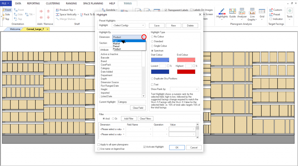
The spectrum only works in the Fact dimension and may only be used in numerical numbers such as Sales, Units and Days Of Supply.
Setting Up A Spectrum Highlight
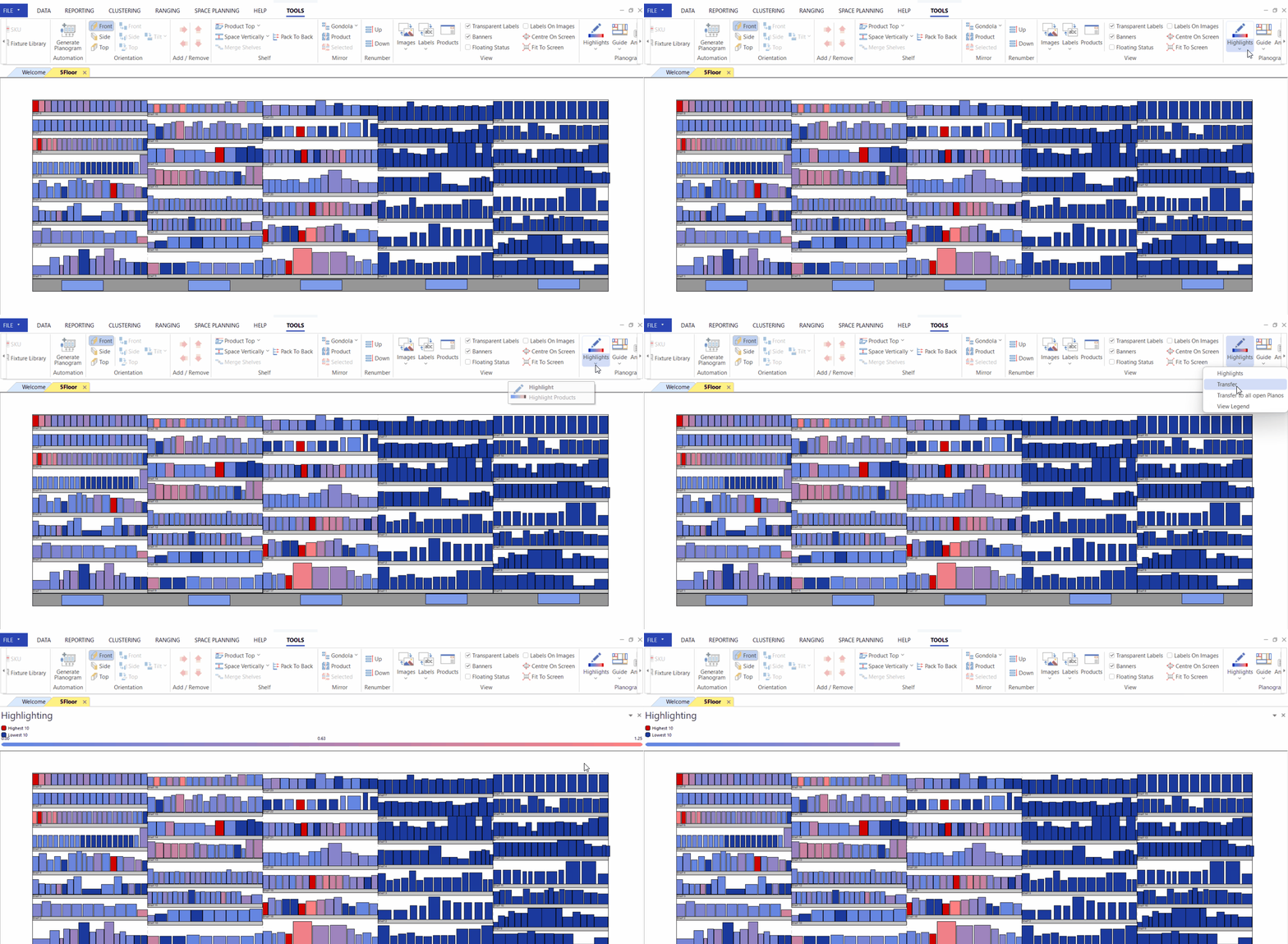
With your planogram open, ensure that images are turned off.
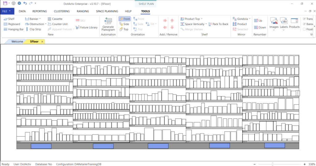
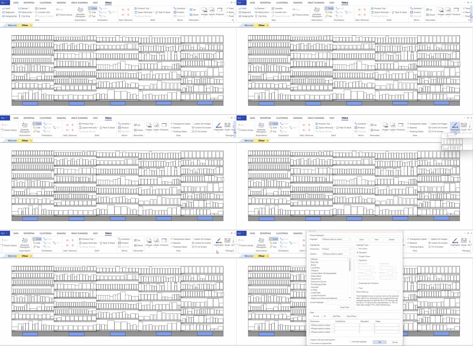
Next, navigate to the ‘Tools’ tab, and in the ‘View’ section, click on the ‘Highlights’ icon.

Doing so opens the ‘Highlights’ window.
Under the ‘Dimensions’ box, choose ‘Fact.
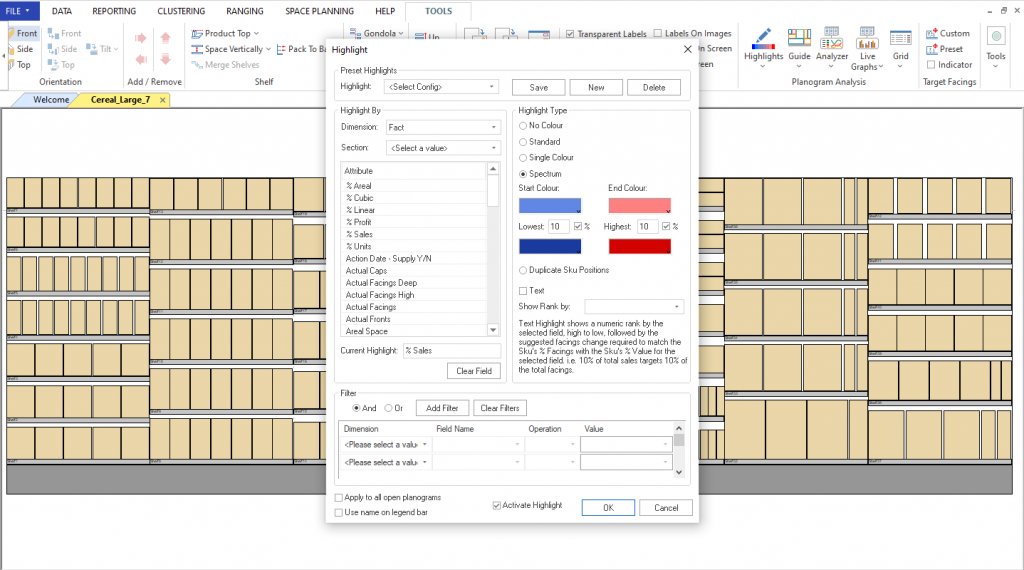
On the right-hand side, select Spectrum. Then choose your start colour and end colour as well as your highest and lowest values and click ‘OK ‘.
In the dockable window situated above your planogram – labeled ‘Legend’ – you can see the top five products and the bottom five products according to the colour you chose. In this example, the top five products are red while the bottom five are blue.

If the ‘Legend’ window does not show, click on the drop-down arrow on the ‘Highlight’ icon and choose ‘View legend’.
You can also use a percentage in your spectrum highlight by clicking on the % box while in the ‘Highlights’ window.
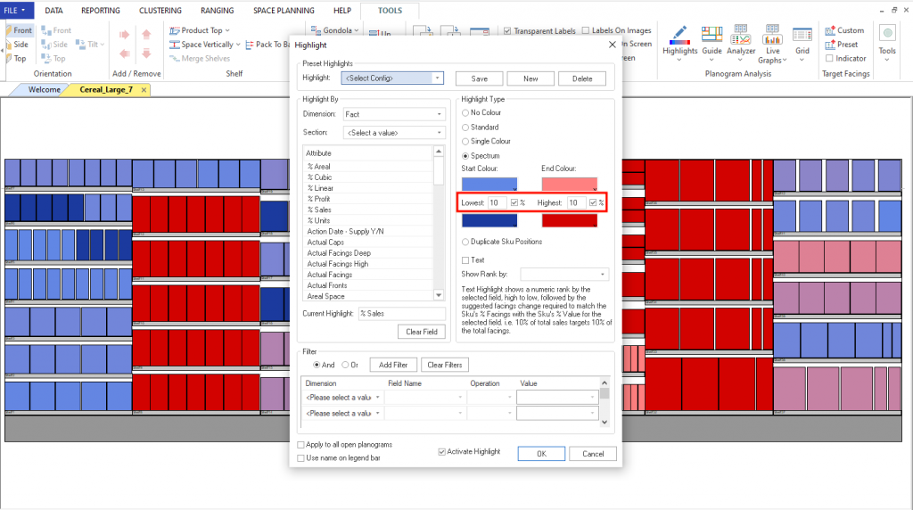
For example, 5% will indicate the top 5% of all the products and the bottom 5% of all the products.
Should the above steps not work for you, please create a support ticket and the DotActiv support team will assist you in uncovering the issue.
