The purpose of this article is to help you understand and read the range optimizer results grid found in the DotActiv software.
Please note that Range Optimizer is used to optimise a range based on certain variables or rules. Range Optimizer applies rules to a range and the DotActiv software can apply logic to suggest a range. This function is also used when creating a new range.
On the other hand, Range Maintenance holds the current range and allows you to run basic ranges that have no rules. This allows the user to choose between the range created in Range Optimizer or to run the data from where the database is maintained.
Reading The Range Optimizer Results Grid
After opening the DotActiv software, navigate to the ‘Ranging’ tab and select the ‘Optimizer’ icon in the ‘Ranging’ section.
After opening your range, ensure that you are in the ‘Tools’ tab.
Range Optimizer ‘View’ Section
Totals In Header
Below the column headings, there is a row containing the grand totals. You can choose to show this row (i.e turn this row on) by right-clicking and selecting ‘Visible’ from the context menu. Click on ‘Visible’ to deselect this row and to turn it off.
You can also turn it on and off by ticking the checkbox next to ‘Totals In Header’ under the ‘View’ section.
Show Full Screen
You can view it in full screen by pressing on the ‘Show Full Screen’ button in the ‘View’ section.
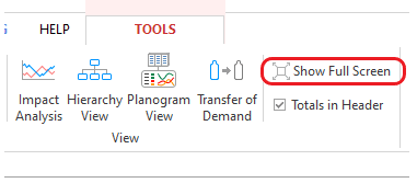
With Range Optimizer, you can make range decisions on both the summary grid by ticking and unticking the POG indicator or on the planogram view. You also have reporting options that appear in the toolbar at the top of your screen, such as the hierarchy view, impact analysis and transfer of demand report.
Planogram View
Click on ‘Planogram View’ if you wish to see a planogram or planoguide view of the range. You can click on the ‘Show Images’ button if you wish to work with the images.
In this view, you are able to change your range by working on the planogram. You can drag rows from the range and drop them on any shelf to add to the planogram or drag items to the red shelf that you wish to remove from the range.
This view is updatable with the summary grid by clicking the ‘Apply Grid Range’ button. You can also view the planogram as a planoguide if necessary.
If you would like to see where products have been delisted and where there is now space available on the planogram you can right-click on a product and click delist and turn your images off to see the products reflect in red.
If you change the facings by clicking on a product and then selecting a number on your keyboard, these products will reflect in orange.
If you add products to the planogram, these products will appear in green.
If you wish to range with sustainability in mind, you can do so here on the planogram too. On the right you will see a small results grid for the planogram where you can see different fact fields such as eco-packaging or sustainability. So, you would be able to see how a product’s composition has eco-packaging or sustainability.
Hierarchy view
The hierarchy view shows the impact of the range changes you have made within the context of the whole product category.
The Hierarchy view is used to identify per hierarchy level where the range is under, over or within its cap. This can be used to identify where there should be delistings or products added to the range based on the contribution.
When the range is over-ranged or under-ranged the user can derive justification thereof from prior supplier agreements, prioritising house brands or any other requests that may skew the range according to the range cap.
- Levels of the hierarchy that are over-ranged appear in red.
- Levels of the hierarchy that fit within the range cap appear in green.
- Levels of the hierarchy that are under ranged appear in yellow.
Impact Analysis
This is a grid showing the impact of the proposed range changes drilled down to the brand level which is linked to the KPIs you selected in your range settings.
The Impact Analysis refers to the impact of the changes to the proposed ranges. The Impact Analysis Grid shows the current & suggested range count, the range caps, sales %, sales loss, KPI, average sales, units & profits for a certain period. Take note, the ‘Sales Of Products Listed Before’ will always refer to the Simple Sales. The grid showing the impact of the suggested range can be detailed to brand level relating to the KPI’s the user has selected in the range settings.
The point of the analysis is to ensure that the top-performing SKUs are in fact ranged while ensuring that the range does not exceed its limit/ range cap. The impact analysis also reviews the impact of product listing and delisting on sales value, volume and profit.
The grid is beneficial and will assist in the analysis of the suggested range plan as it will show the changes to the sales of the products that have been delisted or removed from the range. It will detail the performance of the products remaining in the range and will support the evidence of why certain products were removed, only if there is minimal loss in sales. The goal is to keep brands that will increase sales and generate the most profits.
The grid is also beneficial for sustainability, with indicating the difference in sustainability in the new range plan (from the old range). This assists with analyzing the amount of impact the changes in the range plan have on the sustainability element.
To review the Impact Analysis:
1. Important to examine each plan in the range i.e., AA_5, AB_4 & BA_3 etc.
2. See if the proposed range fits within the range cap down to each plan as each plan has different range caps. Some might be larger than others. Also compare the total delisted and newly listed products as there may be different reasoning for delisting or adding a product such as poor performance, suspended products, newly added products, etc.
3. Note to analyse the sales as this will indicate whether the changes made are reasonable. Compare the differences between the total sales of the current (before) range to the total sales of the proposed (after) range. The goal is for the suggested range to have higher sales. Furthermore, review the total sales that were lost from the delisted products as well as the percentage sales loss. It shows the average sales per period of products that were delisted.
4. Compare the differences between the percentage sales of the current range to the percentage sales of the proposed range from the House Brands. The higher the sales of House Brands means that the clients will generate more profits and will be advantageous to the company.
5. Review the total sales, profits and units per store regarding the KPI’s.
Please note that this can be utilised to determine where it would be best to add new listings, which sub-categories would be most beneficial and least beneficial to list per cluster.
Understanding the Sales section in the Impact Analysis
1. Sales Of Products Listed Before
This is the current average sales per period of ranged products.
Regardless of selecting Simple, Weighted or Numeric Distribution, the ‘Sales Of Products Listed Before’ will always refer to the Simple Sales. This merely relates to the actual sales of the products before making changes to the assortment.
2. Sales Of Products Listed After
‘Sales Before’ – ‘Sales Loss’ + ‘Transfer Of Demand’ + ‘Potential Sales’
This refers to the estimated sales after having made changes to the assortment.
3. Sales Loss From De-Lists
Average Sales Per Period Of Products Being De-Listed
This merely refers to the sales that will be lost after making changes to the assortment.
4. % Sales Lost
Sales From Delisted Products As A Percentage Over The Currently Ranged Average Saes Per Period
This is plainly stating the lost sales as a percentage.
5. Transfer Of Demand
This is the sales that are transferred from removed products to replacement products.
6. Potential Sales
This tallies the difference between weighted and simple sales for all products in the proposed range.
7. % Gains
‘Potential Sales’ + ‘Transfer Of Demand’ as a percentage over simple sales before.
The potential sales is the difference between weighted and simple sales for all products in the proposed range. The simple sales are the actual captured sales, whereas, the weighted sales include the calculated sales that could be achieved from stores for which there are no sales.
Understanding the Sustainability Metrics In The Impact Analysis Grid
The Impact Analysis grid for both ranging and custom reporting include the following sustainability metrics that can be used to understand the impact of changes to your range on your sustainability objectives.
1. Sales Of Ranged Products (Before & After)
This refers to the average sales per period of ranged sustainable products.
2. Sales Loss From Delists
This is the average sales per period of sustainable products being delisted.
3. Units Of Ranged Products (Before & After)
The average units per period of ranged sustainable products.
4. Units Loss From Delists
This refers to the average units per period of sustainable products being delisted.
5. % Profit Of Ranged Products (Before & After)
This includes the percentage of the profit in the current or proposed range from sustainable products.
6. % SKU Count Of Ranged Products (Before & After)
This is the percentage of the current or proposed range which are sustainable products.
Transfer Of Demand Report
This report provides details of what will happen to the sales of the products being delisted. A portion of the sales that were attributed to the delisted products will be transferred over to the products that remain in the range. The delisted products are detailed in terms of their performance and levels of the hierarchy and brand profile.
This information is used to find the top-performing or best substitute to which the sales will be transferred. A substitute will be provided for each delisted product. Take note, the ‘Sales Of Products Listed Before’ will always refer to the Simple Sales.
You can click on the product description to see the top ten options based on the brand and product description and select a replacement if you would like an alternative.
Please note that for each delisted product, up to 5 options are provided which consist of ranged products from the same hierarchy group (Sub Category, maybe Segment and Subsegment) and from the same brand ranked by sales and then another 5 products based on the product description.
The purpose of a transfer of demand report is to identify SKUs that are best suited to replace those that the planner has removed from the existing range. This report identifies where the consumer’s demand for a particular type of product can be transferred to a substitute product and the impact thereof on sales.
Reasons for removing these SKUs from the range may vary so this does not mean that type of product has no use to the category or consumer but it could be the brand that is not performing well as compared to other brands with a product that serves a similar function. This report shows the direct impact on sales(%) when the demand for one product(de-listed) is transferred to another/new product(listed).
The transfer of demand analysis is based on the price point, brand and brand profile of the products in the range. It shows delisted product details vs. substitutions and this aids in justifying the substitution of products by ensuring that there is minimal/ no loss in sales due to the substitution. This is because the alternative product essentially fulfils the same core customer needs criteria even though it may be a different brand/flavour/colour etc.
Additionally, the transfer of demand report indicates predicted losses due to substitution of the similar type of product by illustrating the impact that the substitution will have on sales. Depending on the similarity of the substitute product, the predicted transfer in sales, units and GP can be based on 100%, 75% or 50%. The more interchangeable the product, the higher the expected transfers and less losses.
Transfer of demand is typically worked out based on the brand profile. If products fit the same brand profile then an estimated 100% of the sales will be transferred.
If the products fit slightly different brand profiles (e.g. economy to mid-tier or mid-tier to premium) an estimated 75% of the sales will be transferred to the product(s) remaining in the range.
If the product fits completely different brand profiles (e.g. economy to premium) then an estimated 50% of the sales will be transferred.
Rules
Rules are pre-set-up calculations that give products a points-scoring based on the rules that are linked to them. Your products are then ranked based on specific attributes to address the needs of your customers.
Basic rules include Sales and Units, Time on Shelf, Good Better Best, SKU Size Limiter and many others. If you have a specific rule that influences the weighting of your SKU then custom rules can be created for you based on specific scenarios.
Rules such as Eco-Packaging and Product Sustainability are more specific and lean towards the growing idea of sustainability. Which influences the weighting of the SKUs with the range plan.
You can view the rule information that you’ve applied to your range by clicking on ‘Rules’ in the ‘View’ section.
You can now also choose between Simple, Weighted or Numeric Distribution in calculating Sales and Units by clicking on ‘Range Settings’ in the ‘Range Optimizer’ Tab and then selecting ‘Results Grid’. Remember to run the plan again after making your choice. Below is a demonstration.
Clones
In the ‘View’ section, you can find ‘Clones’. This function allows you to view the relevant clone information for new products.
Product clones can be used when you have new products in your database with no sales data. To ensure that the Range Optimizer doesn’t recommend delisting the products based on ‘poor performance’, cloning can be used to assign the sales data of a similar or substitute product to the new listing for a period of time.
The product clone feature works on the same logic as the transfer of demand report. This means that it will find the closest, top-performing substitute for the new product and recommend this as the clone.
If the new listing and the clone have the same brand profile, a recommended 100% of the sales will be cloned. If they have slightly different brand profiles (e.g. Economy and Mid-tier), an estimated 75% of the sales will be cloned. If they have completely different brand profiles (e.g. Economy and Premium), 50% of the sales will be cloned.
Please note that if it is greyed out, it means there are no clones.
Columns Displayed On The Grid
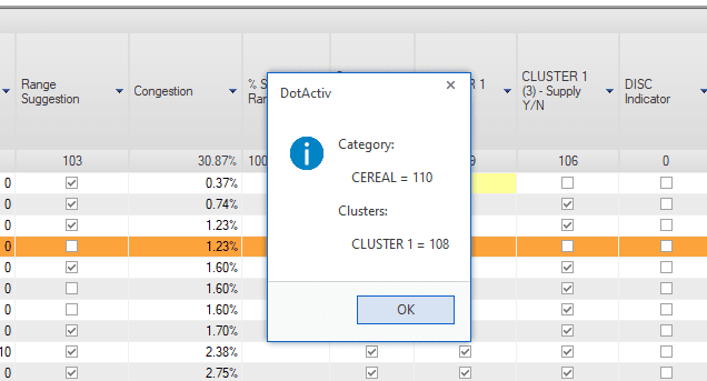
- Total Points: Points are allocated to each product based on the inputs given. The colours used are also as per the set-up in the highlights section.
- Range Suggestion: The range recommended by the DotActiv software is indicated by a tick, based on the category caps and contribution. The tick boxes can be used to add products to the range.
- Congestion: Indicates the percentage congestion of the suggested range upon the planogram. It is based on the available space.
- Percentage SKU’s Ranged: Contribution of each group in the total range count.
- On Current Plano: Confirms whether the item is currently on planogram or not.
- POG Indicator: Indicates whether an item is currently selected to be part of the range. POG refers to the planogram.
- Supply Indicator: Indicates if there is stock available for supply to the store. The value in brackets indicates the number of stores within the cluster.
- DISC Indicator: If the checkbox is ticked, it indicates that the product has been discontinued.
- Range Cap: Indicates each sub-total row’s respective range cap. For example, if your S.T. is set to Sub Category, it will indicate each sub categories’ cap.
If so desired, you can freeze specific columns into place. Right-click on the column you want frozen and select ‘Freeze’ from the context menu. As you scroll, your chosen column will remain on the screen, as shown below.
Range Optimizer Highlight ‘Legend’
You can turn the ‘Highlights Legend’ on and off. To do this, navigate to the ‘View’ section, and select ‘Legend’. As seen below, a dockable window appears with the various highlights.
Please note that only one highlight can be selected at a time.
- Recommended: These are the products that the DotActiv software recommends that you include.
- Recommended vs Selected: This compares the products recommended by the DotActiv software versus those selected by you, the user.
- Supply vs Selected: This takes the user-selected range into consideration. It indicates the difference between the suggested range and the supply indicator. It also provides a warning, showing that there is still stock on hand but the item is not on the planogram.
- Changes: This indicates the changes made on the grid.
- Changes From Live: Changes that are currently different from what is saved in the database.
- Warnings: This works with the POG and supply indicators, using a 5-week rule check. This is only applied when using the range to POG function. When the POG function is turned off, the DotActiv software will apply the logic.
Please note that you can integrate your ERP system with the DotActiv software if you would like to manage your safety stock to avoid ‘Out Of Stocks’. Learn more about How DotActiv Approaches Integration here.
Range ‘Caps‘
This function indicates when you exceed cluster or category caps. You can click on ‘Caps’ under the ‘View’ section if you need to see the values you’ve chosen. If too many items are selected, the entire supply column will turn red.
Each sub-total row’s respective range cap is also indicated in the ‘Range Cap’ column. Once ‘Warnings’ are turned on, it will be highlighted in red if the subtotal group has been over-ranged or in yellow if the subtotal group has been under-ranged.
Brand Profiles
Also found within the ‘Tools’ tab, the ‘Brand Profiles’ function allows you to view the brand profile composition of your ranges.
Within the ‘Brand Profile Composition’ window, you can select a row within the grid to update the pie chart on the right-hand side of the window, as seen below. More specifically, if you would like to view the pie chart of another range you can simply click on that range in the grid and the chart will be updated.
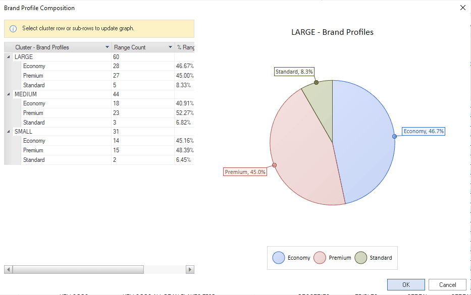
You can export the pie chart by simply right-clicking on the chart and clicking on ‘Export’ and it will export to a PNG file.
Range Optimizer ‘Copy’ Section
Range To POG and Range To Supply
Once you have finished working on the recommended range, you can click on ‘Range To POG’ under the ‘Copy’ section.
It’s recommended that once completed, you should view the Warnings highlight.
If so desired, you can also use the ‘Range to Supply’ indicator. Click ‘Range To Supply’.
Range Optimizer Summary
After the suggested ranging has been completed and the reports have been reviewed, the summary can be viewed. Here the user can view the range decisions that have been made for all clusters. Double-checking if decisions make sense and if nesting has been applied accurately.
This means that the base range for a cluster is included in all variations and any delisting suggestions follow the correct trend. For example, if a SKU has been removed from the largest range within a cluster, it has been removed from all the subsequent smaller ranges. This ensures that the top performers found within the base range are everywhere (what is in the smallest can be found in all stores), whilst ensuring that certain lines are found only within the correct cluster size, optimising caps and space.
Along with the summary the user can view the range suggestion upon the planogram itself (after updating planograms). Here the user is able to confirm decisions by looking at DOS/ DSC and weekly movement as well as reviewing the range on the planogram itself in terms of space and optimised.
Range Optimizer ‘File’ Section
Refresh From DB
If you are unsure about what changes you made, you can click on ‘Refresh From DB’ under the ‘File’ section. This clears all the changes and refers back to the original data in your database.
Then click ‘OK’.
Save Range
To save your range, you will find ‘Save Range’ in the ‘View’ section. Click ‘OK’ to save the changes.
Moving Between Clusters Without Losing Changes
The user can now make changes while switching between clusters without having to update the database in between. It is then the user’s choice to only update the database once changes have been made to all clusters. An example of A Range and B Range is provided below.
Once all changes have been made on a cluster, the user can utilize the ‘Save’ dialogue. The ‘Save’ dialogue merely refers to whether the user wants to save the changes to the database. Should the user click on ‘No’, the changes for Cluster A will remain intact without being updated in the database. The user will then be able to work on Cluster B and only update all changes to the database once the entire process has been completed.
Update DB
Once you are happy with your changes, you can save them to your database.
Click ‘Update DB’ in the ‘File’ section. This function will save your DISC, POG, and Supply Indicators. When updating your database, it will also back up your database.
Grid To Excel
To export your grids, click on ‘Grid To Excel’ which is found in the ‘File’ section of the Tools tab. Once you have selected an output directory, give your file a name and click on ‘Save’. You will receive a pop-up window notifying you that it has been completed.
This will export all grids to a single XLS file i.e. the transfer of demand, impact analysis, and the main results grid per cluster. However, if you have the summary grid open, it will export all the ranges together on one tab within the XLS file.
Update Plano
Click on the ‘Update Plano’ button in the ‘File’ section.
The ‘Range Optimizer – Update Planograms’ window will appear as seen below.
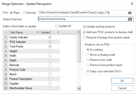
Here, you can see the planogram or the directory of planograms you wish to update. You can also select the fields to update. Tick the checkboxes that you want to apply an update to.
You can also:
- Update your existing products,
- Add new ‘POG’ products to a dummy shelf, and
- Remove facings from the product report.
With products not on the POG, you can decide what you want to do:
- Do Nothing,
- Move to Floating Shelf,
- Remove From Shelf, and
- Remove From Product Report.
You can also tick or untick the box next to ‘Keep Cross-Merched SKU’s’.
Click ‘OK’ and ‘OK’ again after viewing the ‘Select Planograms To Update’ window.
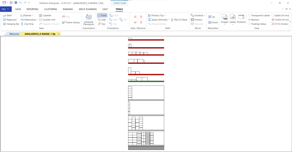
Once you have updated your planogram, and selected to move the products that are not on the planogram to a floating shelf, the delisted products will appear on different red floating shelves as it is split by the subtitle field in the grid (i.e. subcategory). Furthermore, the products will be sorted by brand and then height on the shelf itself.
On the other hand, any new products that were added will appear on a green shelf which will also be sorted by brand and then by height, as seen in the example below.
Should the above steps not work, please create a support ticket and the DotActiv support team will assist you in uncovering the issue.
