The purpose of this article is to offer you a clear step-by-step process to add a planogram to a report template while working in the DotActiv software.
Applicable Products: DotActiv Enterprise
Adding A Planogram
After opening the DotActiv software, ensure you are in the ‘Reporting’ tab.
Once there, navigate to the ‘Advanced’ section and click on the drop-down arrow next to ‘Custom Report’. Select ‘Report Builder’.
The ‘Custom Report Builder – Templates’ window appears. Here, you can either choose an existing template or create a new one.
After selecting your chosen report, you’re taken to your report. On the left, you’ll find a dockable window labelled ‘Objects’. From here, you can click on ‘Planogram’ and then click on the report.
The ‘Custom Report Builder – Plano Properties’ window appears.
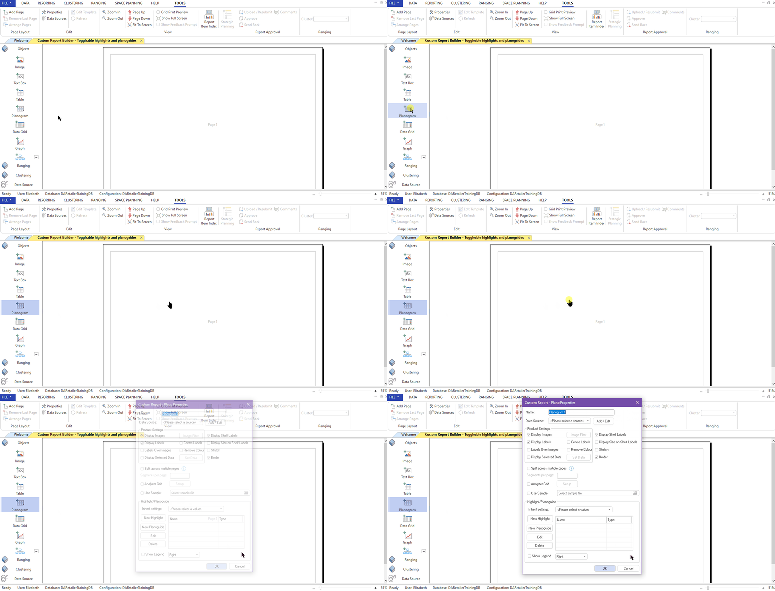
First, give your planogram a name.
You also need to specify from where the DotActiv software must get this planogram file. To do that, click on the drop-down menu next to ‘Data Source’.
In most cases, the planogram that you will be referencing will be located locally so you will make use of a local FLP format. Then click on ‘OK’.
Product Settings
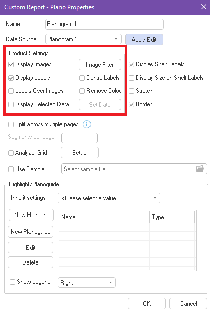
In the Product Settings box, you are able to choose whether you would like to display images, labels, labels over images, selected data, centre your labels or remove the colour of your products.
Here, you also have the option of adding ‘Image Filters’ which allows you to only display selected product images on the planogram.
Highlights/Planoguide
When adding a planogram to a custom report, you have the option to configure any number of highlights and planoguide settings.
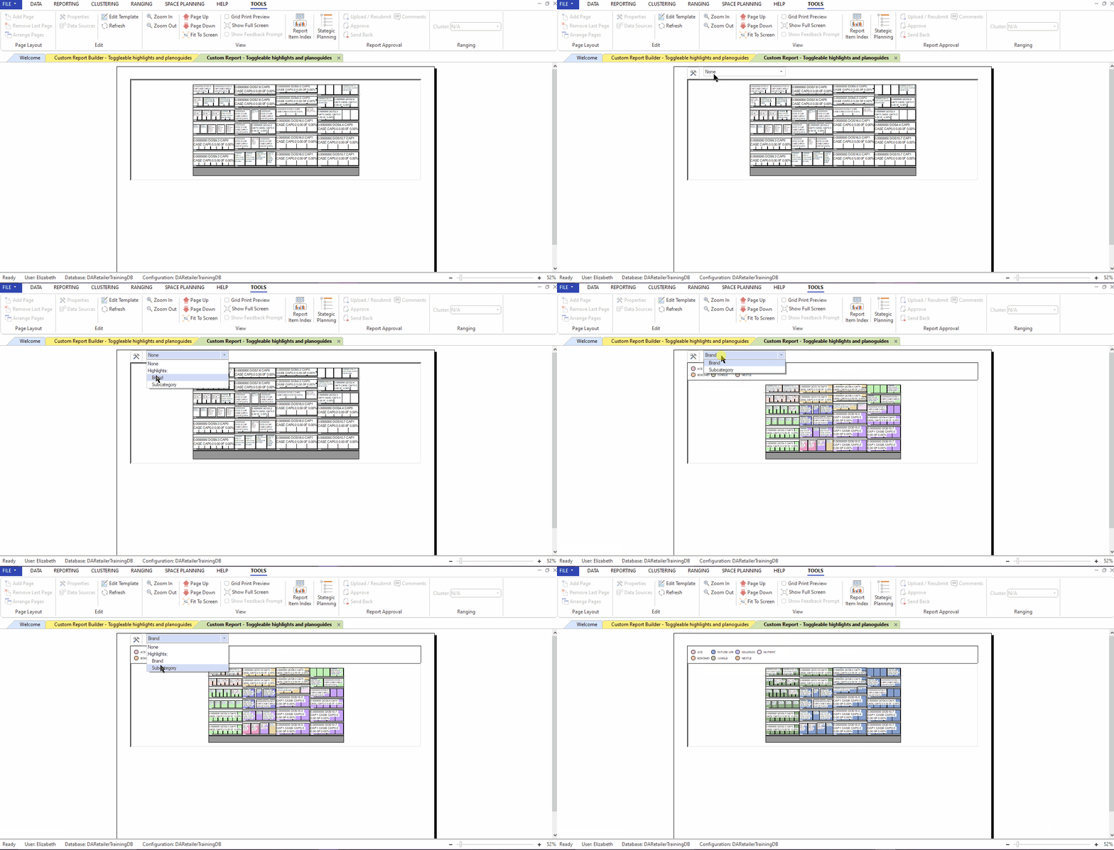
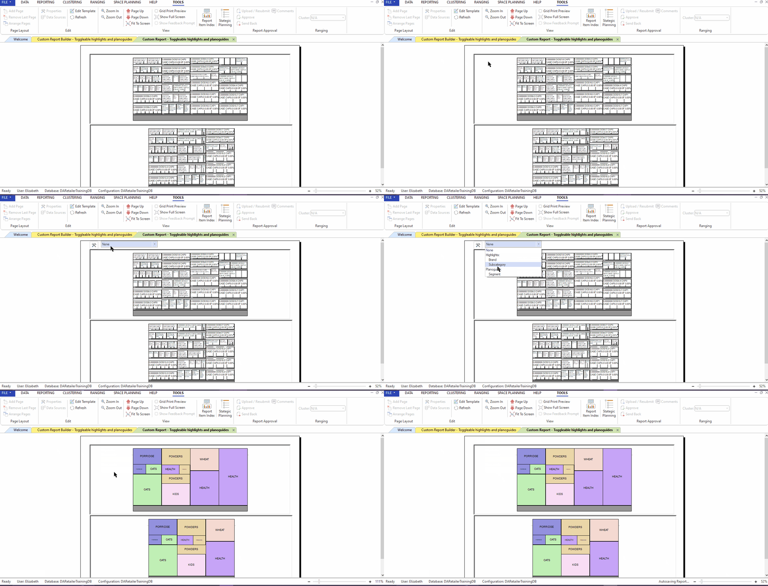
None of the configurations will show in builder mode but rather once the report is run. A dropdown box will be available above the item when hovering over it that you can use to toggle between the configured highlights and planoguide settings. The planogram will update accordingly.
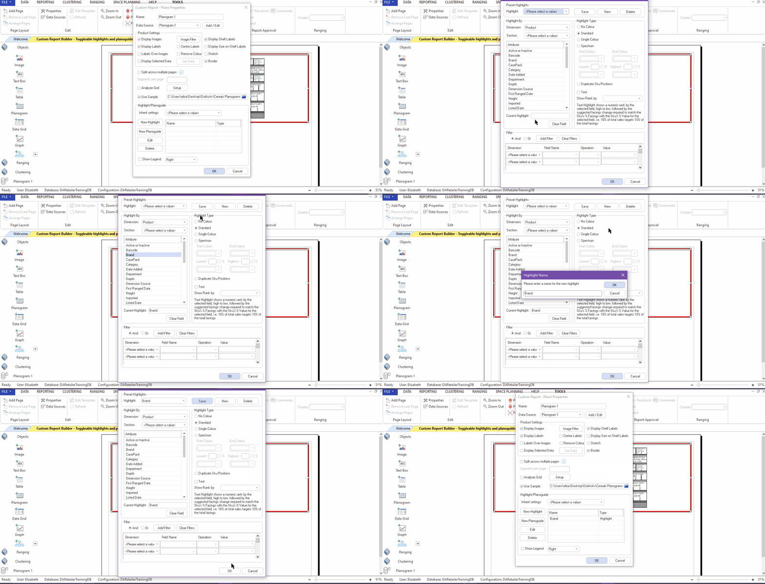
To add a new highlights configuration, click on ‘New Highlight’. Make sure you select the “Use Sample” option and link the planogram that will be used.
Select the fields that you would like to highlight and give your new highlight a name. After you click okay, the highlight config will appear in the block on the right.
After you run the report, you will be able to toggle between the highlights that you have created.
Additionally, you can add another planogram and set it to inherit the filters of your first planogram.
To apply inherit settings, in your plano properties window select the planogram you would like to inherit from in the drop-down menu.

You will now be able to toggle between your highlights on the first planogram and have the changes reflect on the second planogram as well.

To add a planoguide configuration, in the plano properties window, click on ‘New Planoguide’ and select the field you would like to display in the drop-down menu. After you click okay, the planoguide config will appear in the block on the right.
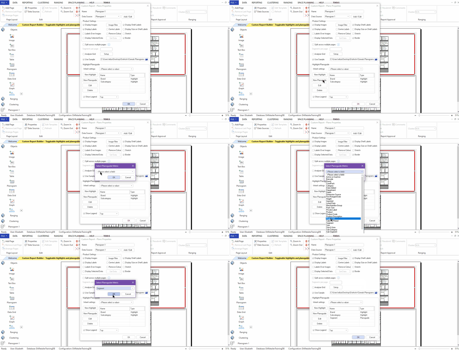
On your run report you will be able to toggle between the highlights and the planoguide.
Linking Planogram Highlights To A Graph
When creating a Custom Report, the option exists to link the highlights of a planogram to a graph. By linking the planogram and the graph, the highlight colours on the graph will match the highlight colours on the planogram.
After adding a plangram with the relevant highlight fields and adding a graph, in the ‘Graph Properties’, click on the “Inherit filter from” drop-down menu to select the planogram that should be linked to the graph.
Remember to set the Data Fields for the graph before selecting “OK”.
Your planogram and graph should now be linked by indicating the same highlights based on the highlight setting you selected. For instance, should your planogram highlight be set to ‘Brand’, the graph will now show a matching highlight on Brand level.
Plano Analyzer
You can also choose to display the ‘Plano Analyzer’ alongside the planogram that you have added to the report. Simply tick the box next to ‘Plano Analyzer’ in the properties window as seen below.
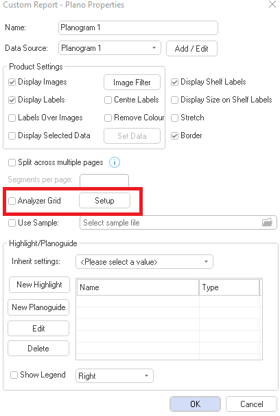
Once you have ticked the box and added the planogram, you can ‘Setup’ the Analyzer. Click ‘Setup’ in the properties window if you’d like to set up the Plano Analyzer for this report, as seen below.
In the Plano Analyzer Setup window, you can add a field by double-clicking on the field in the list on the left-hand side of the window. This will add the field to the right-hand side.
Once happy, click ‘OK’ and then ‘OK’ again to view the Analyzer next to the planogram.
Should the above steps not work for you, please create a support ticket and DotActiv support will assist you in uncovering the issue.
