The purpose of this article is to offer you a clear step-by-step process to add a range plan to a custom report while working with the DotActiv software.
Adding A Range Plan
After opening the DotActiv software, ensure you are in the ‘Reporting’ tab.
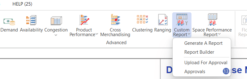
Once there, navigate to the ‘Advanced’ section and click on the drop-down arrow next to ‘Custom Report’. Select ‘Report Builder’.
The ‘Custom Report Builder – Templates’ window appears. Here, you can either choose an existing template or create a new one.

After selecting your chosen report, you’re taken to your report.
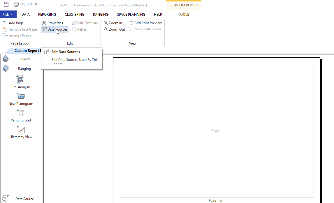
You can add a Ranging data source by clicking on ‘Data Sources’ found under ‘Tools’. Please see the gif below for the exact steps.
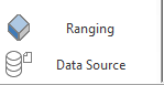
Once you have done this, navigate to your left-hand pane. On the left, you will find dockable windows labelled ‘Objects’ and ‘Ranging’. Click on ‘Ranging’, as seen in the screenshot below.
You will now be presented with additional add-ons seen in the screenshot below.
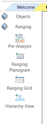
Add any of the reports by first clicking on the add-on and then the page you want to add it to. We will unpack these add-ons below.
Pre-Analysis
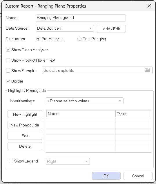
The ‘Ranging Plano Properties’ window will appear if you add the ‘Pre-Analysis’ report.
You can choose which planogram to display, the ‘Pre-Analysis’ or ‘Post-Ranging’ planogram linked to the range plan.
The ‘Show Product Hover Text’ option allows you to show labels over the products as you hover over them.
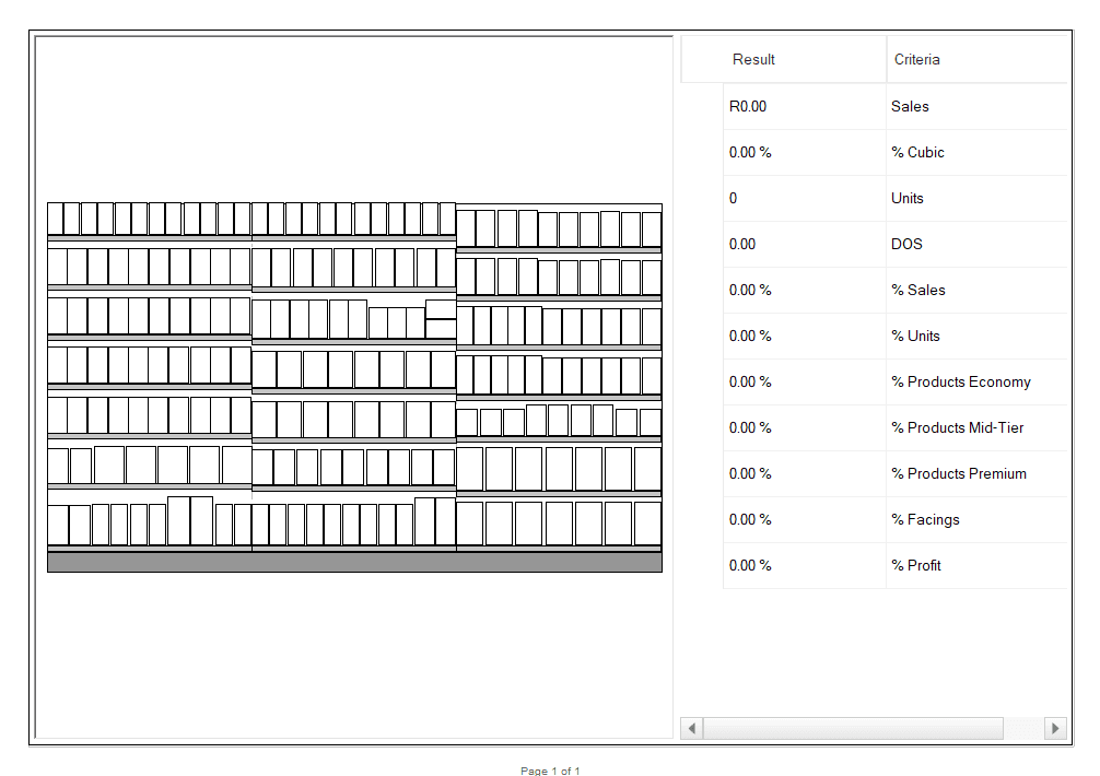
Choose a planogram by checking the ‘Show Sample’ box and then clicking on the file button. Once a planogram has been selected, press ‘OK’. The Pre-Analysis will appear, as seen in the example below.
New Planogram
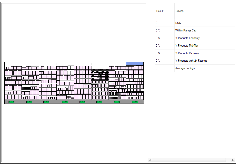
The ‘Ranging Plano Properties’ window will appear if you add the ‘New Planogram’ report.
Choose a planogram by checking the ‘Show Sample’ box and then clicking on the file button. Once a planogram has been selected, press ‘OK’.
The new planogram will now appear.
Please note that if you would like to fit the planogram to your screen, you can do so by simply right-clicking and selecting ‘Fit’.
Ranging Grids
The ‘Ranging Grid Properties’ window will appear if you add the ‘Ranging Grid’.

You are now able to choose the ranging grid you would like to use within this window. You can choose from the different range types, such as Ranging Grid, Ranging Summary, Impact Analysis, Transfer of Demand, Post Plano Analysis, KPI Comparison, ADDM Report or Changes Report. Click on ‘OK’ once you have done so.
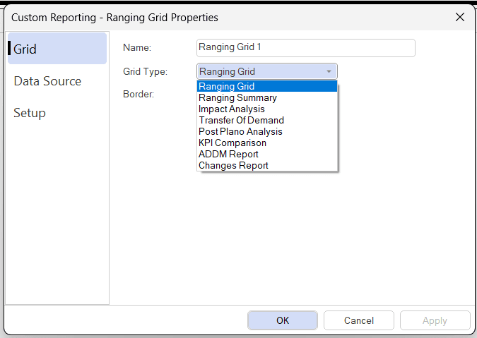
The KPI Comparison grid simply shows the calculated value for each selected KPI per row for both the configured pre and post-ranging planograms from the linked ranging object (and current range split/cluster) as well as the relevant target KPI value from the database.
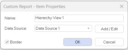
Hierarchy View
The ‘Ranging Properties’ window will appear if you add the ‘Hierarchy view’. Make sure all properties are in order and press ‘OK’.
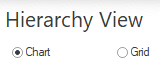
Once you have done so, the hierarchy view will appear as seen in the example below.

You also have the option to toggle between the ‘Chart’, as seen in the screenshot above, and ‘Grid’ views.
Once done adding all the reports, you can save your custom report.
How To Generate A Report And Link A Range Plan
Once you have added the relevant range reports to your template, you can link an existing range plan.
To create a report with your range plan, go to ‘Reporting’, ‘Custom Report’ and select ‘Generate A Report’. Choose your saved template as you created according to the steps above and link your range plan to the custom report as per the GIF below.

Learn more about how to create a custom report in this article linked here.
If the above steps do not work for you, please log a ticket for our IT Support team who is always willing to assist.