The purpose of this article is to provide you with a clear step-by-step process to creating a custom report in the DotActiv software.
Custom Report creates a standard report template that can be used by multiple shelf planners. This ensures consistency and efficiency as the same report can be used multiple times.
Creating A Custom Report
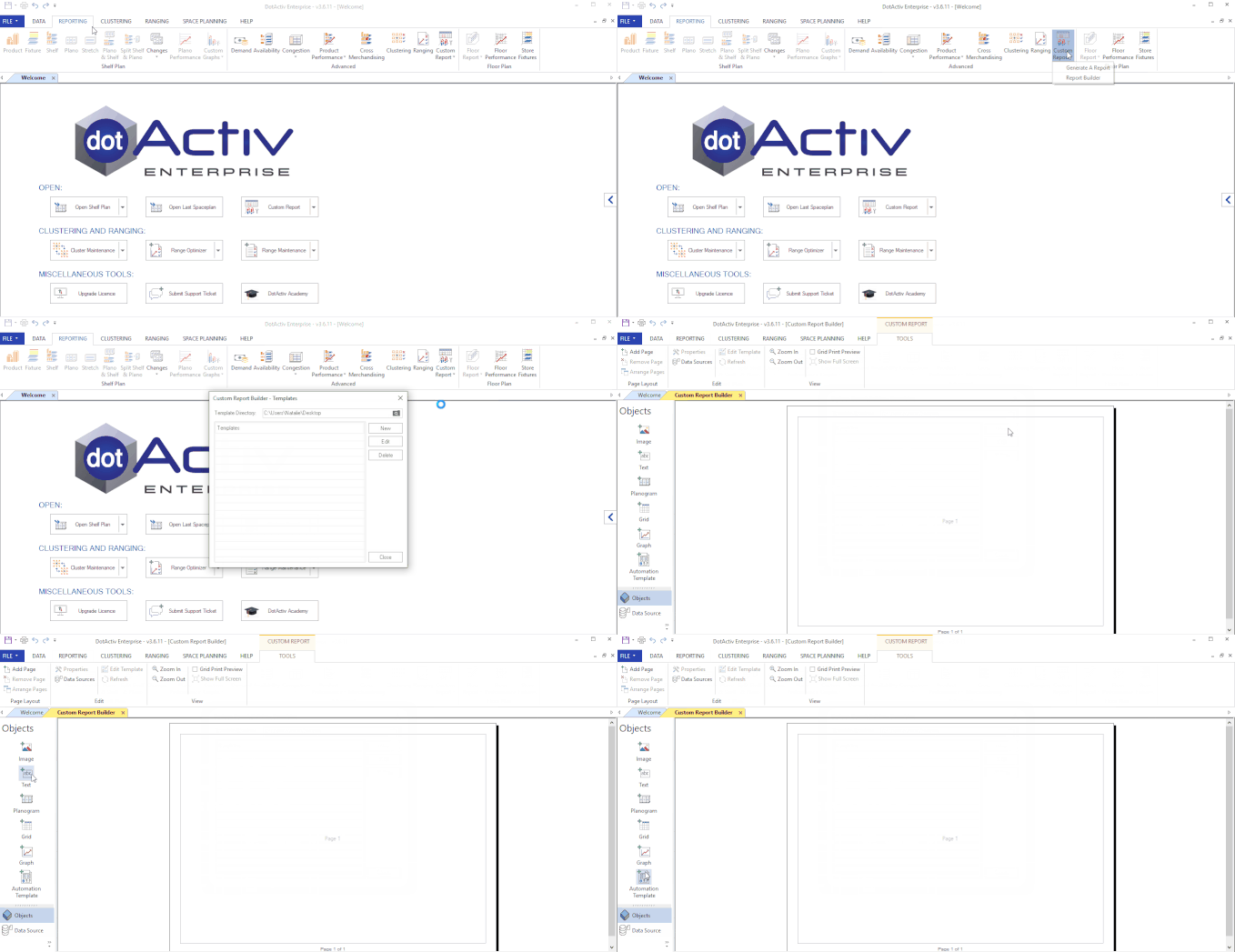
After opening the DotActiv software, ensure you are in the ‘Reporting’ tab. In the ‘Advanced’ section, select ‘Custom Report’. For a new report, click on ‘Report Builder’.

Doing so brings up the ‘Custom Report Builder – Templates’ window. Click on ‘New’ to open a new custom report.
Adding, Removing and Arranging Pages
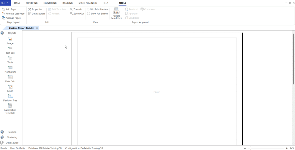
In the ‘Page Layout’ section on the left side of the screen, you will see that you can add, remove or arrange pages.

There are also ‘Edit’ and ‘View’ sections. Underneath is a panel with all the objects that you can add to your custom report.
Adding Data Sources
You can add data sources to a custom report so that accurate sales and unit figures are represented within the planogram and custom graphs.
To add a data source to your custom report, click on the ‘Data Source’ icon in the ‘Edit’ section of the ‘Tools’ tab. At this stage, you can create, edit or delete a data source.
You can also select a data cube from a database and set it as the default cube.
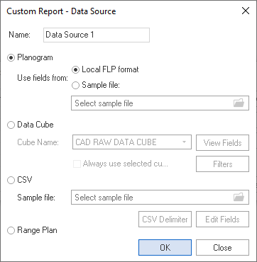
To add a new data source, click on ‘New’. There are four Data Sources that can be used when generating a Custom Report, namely a Planogram, Data Cube, CSV or a Range Plan. You can add a planogram in the local FLP format, which is already open in the DotActiv software, or as a file from your computer.

Once you have selected your data source, you can name it so that you can link any added planograms or graphs. Now, click ‘OK’.
Adding Images
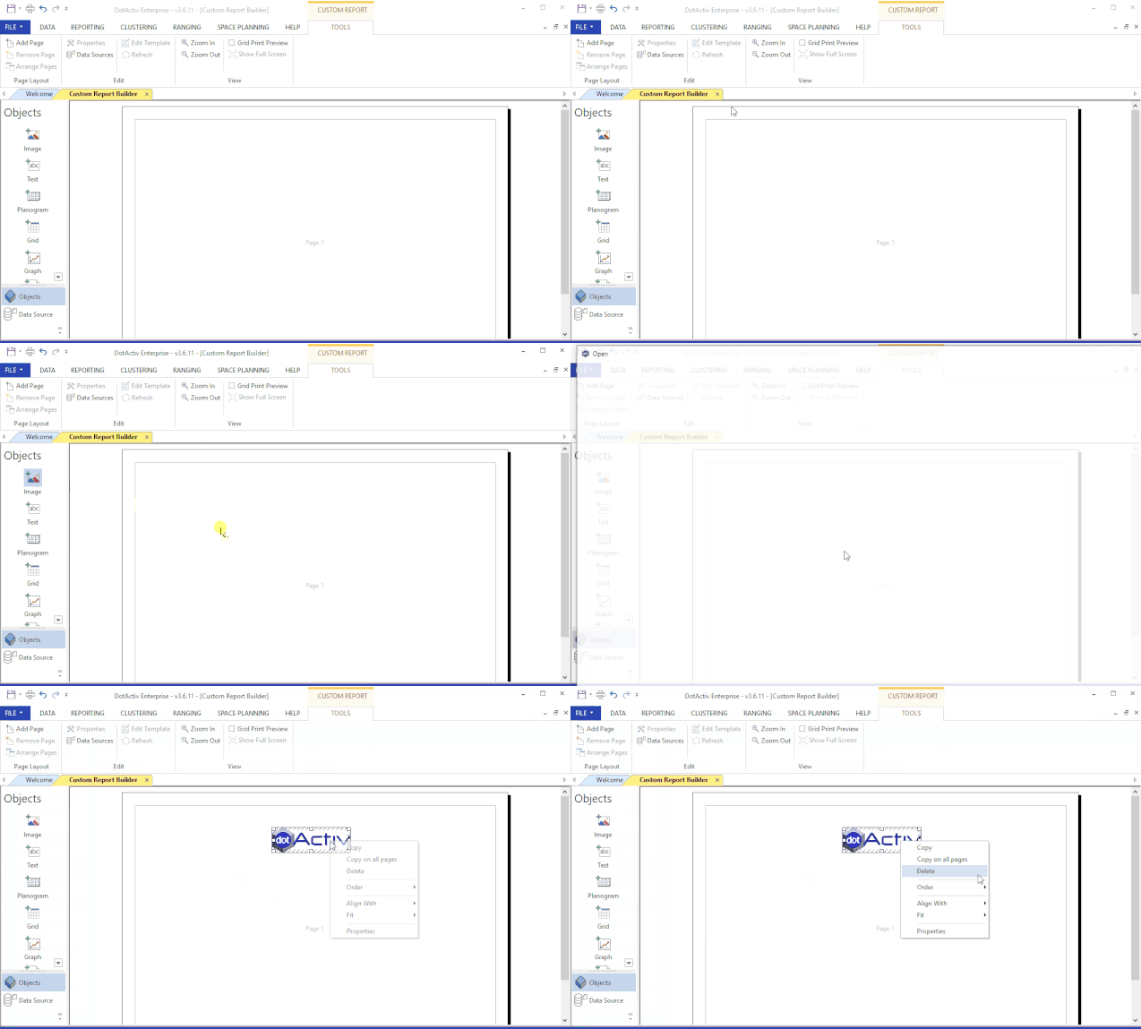
As seen in the GIF below, drag the ‘Image’ icon onto the page and select ‘Other’ from the context menu to search for the image you would like to add.

Once added, you can click on the object to move it around the page and place it. This is true for all objects. If you right-click on the image, a context menu appears with a number of shortcuts appear. These shortcuts are standard for all objects inserted.
Adding Text
To insert text, click on the text object and drag it to the page. Give the text a name and add the text into the box. Alternatively, choose a data source to pull the name from. You can align the text and choose a font.
Where data source is mentioned when creating a custom report, the source of information is being asked for. The data source does not have to be a planogram. It can be a data cube. A data cube is a specific set of information that is located in the Database.
Read this article on how to set up a data cube.
If you would like to report on Data that is in a planogram, select the Planogram as the Data Source. If you would like to report on Data that is located in your Database, for example, sales for a certain product, from a certain store, over a specific period, set up and select a Data Cube to pull the data.
To add the planogram as a data source, click on Add/Edit. Then click on ‘New’. Give the data source a name. Be very specific to ensure that you recall the data source again. Click ‘OK’.
Adding Planograms
When dragging and dropping a ‘Planogram’ onto an empty page, give the Planogram a name and specify the data source. Furthermore, you can specify other Product, Highlight and Planogram Settings.
Adding Grids
Next, insert a ‘Grid’.
Firstly name the grid and then select a data source. If you select a planogram as your data source, you can use this grid as a ‘Base Grid’, ‘Shelf Report’, or ‘Fixture Report’. There are also other grid layout options allowing you to set columns, add calculated column, set filters and place the data in specific sort order.
Adding Graphs
Complete the report by adding a graph and automation template in a similar manner.
Drag the ‘Graph’ to the page. With the Graph Setup open, name the graph and select from various view options. Once the data source has been selected for the graph, click set the data.
Information can be fed into three different areas or fields, namely:
- Measure: this is the data field that is measured such as Category, Sub Category and Brand;
- Data: this is the actual data that will be measured, for example, %Sales and %Unit;
- Data Group: this is an optional field where multiple series will be measured. For example, when creating a Grid, the distinct values of Data Group Fields will be displayed on the table header to order the group data fields accordingly. As demonstrated in the gif below, % profit has been added; and
* Extra Fields: This function can be used to add extra columns whose values are calculated directly off of the field being added.
For example, if you add Sales at Sell as a data field as seen in the gif below, click on the % tickbox. This will automatically be calculated as a percentage contribution of the Sales at Sell column from which it is being added.

To save the Custom Report, press ‘Control’ + ‘S’ or go to ‘File’, ‘Save’ and select the directory.
We recommend that it is always saved in the Directory ‘C:\DotActiv Data\Report Templates’.
Please note that this will be saved as a .drt file. This file format stands for a DotActiv Reporting Template.
Should the above steps not work for you, please create a support ticket and the DotActiv support team will assist you in uncovering the issue.
