The purpose of this article is to offer you a clear step-by-step process to add a graph to a report template while working in DotActiv software.
Please note that this article refers to adding a graph when you are still in the ‘Report Builder’ stage. You are still building a report template in which you’ll insert real data when generating a report.
Your final graph will adjust to convey the real data once you’ve linked it to the graph template created in the report template.
Adding A Graph
After opening DotActiv, ensure you are in the ‘Reporting’ tab.
Once there, navigate to the ‘Advanced’ section and click on the drop-down arrow next to ‘Custom Report’. Select ‘Report Builder’.
The ‘Custom Report Builder – Templates’ window appears. Here, you can either choose an existing template or create a new one.
If you select ‘Existing Template’, it means you want to add/edit a graph template to a Report you have built or are still busy building. If you select ‘New’, it means that you will create a custom report template from scratch (in which you will then add a graph template if you want a graph in your report).
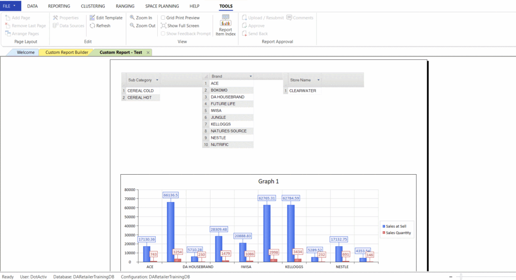
Let’s say you have decided to add a graph template to an existing report. After selecting your chosen report, you’re taken to your report. On the left, you’ll find a dockable window labelled ‘Objects’. Insert a new page by selecting the ‘Add Page’ function under the ‘Tools’ Tab. From here, you can add a graph by dragging and dropping it on the report.
This opens the ‘Custom Report – Graph Setup’ window as seen below.
The above example makes use of a 2D Clustered Column Graph.
Please note that although pie charts don’t have an L-shaped X and Y axis, the principle stays the same. The key displayed on the right will usually be equivalent to your X-axis, where the actual figures/slice breaks of the pie will represent the Y-axis.
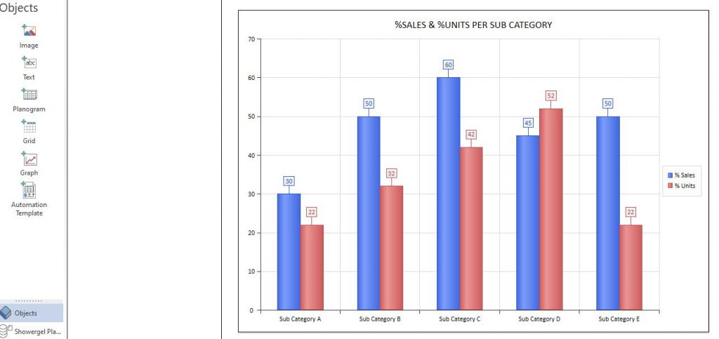
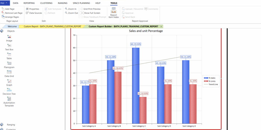
To begin, give your graph a name. Let’s go ahead and name it ‘%Sales and %Units per Sub Category’. Stating what data you want to see and for what groupings/levels, will help to define the X-axis and Y-axis of your graph (discussed later in this article). After you have given your graph a heading, you must select your data source.
Once done, it’s time to set your data. Note that you can only set data after a data source has been selected. Read this article to see how a data source is created and/or selected.
When you set your data, you’re telling ‘Report Builder’ what information you want to display on the graph. In this case, let’s make use of the graph we just named %Sales and %Units per Sub Category. You can find ‘Set Data’ beneath where you choose your data source.
Please note that since this is a graph template, it also displays the information that will be shown when you generate a report by slotting ‘real’ data into that specific template.
For example, if you have set the graph template to show Sales per Sub Category, the graph template will show figures for ‘Sub Category 1,’ ‘Sub Category 2,’ etc. Whereas if you have linked a Long Life Milk planogram/data source to this template when generating a report, the set Sub Categories for that planogram (for example ‘Full Cream Milk’ and ‘Low Fat Milk’) will display on the graph.
The ‘Custom Report – Set Data’ window pops up where you can include all the data specific to your requirements.
Once you’ve selected your Data Source, you can continue to do your ‘General’ and ‘Axis Charts’ setup.
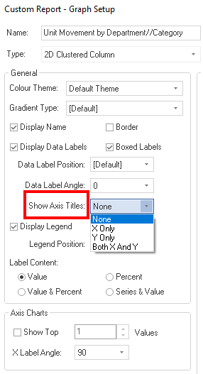
The ‘General’ setup includes the selection of a colour theme, gradient type and other display settings. You are also able to set whether you would like to display certain labels, borders and axis titles, as seen in the screenshot below.
You have the option to display none of the axis titles, only X or Y, or both of the axis titles within your report.
Measure Fields (X-axis)
Under ‘Measure Fields’, you will insert which fields’ %Sales and %Units you would want to see. These fields will be shown on your X-axis and is often Product Dimension field (such as a level from the display hierarchy).
For this example, you can set the ‘Measure’ fields to be:
- Category;
- Sub-Category,
- Brand
You can choose one or multiple fields to display on the X-axis. In the case where you select more than one option, you can drill down to these levels on your graph by double-clicking on the column on the visual graph.
If your graph shows %Sales and %Units per Category, you can double click on the column (on the visual graph), where DotActiv will ask you whether you want to drill down to Sub Category level so the process can go on. To drill back up, simply right-click on the column and select ‘Clear All Filters.’
Data Fields (Y-axis)
In contrast, ‘Data Fields’, are the measurements themselves. It indicates what you want to measure of the ‘Measure Fields’/X-axis. These will most likely be numerical values and will consequently often be fields selected from the ‘Fact Dimension’ The ‘Data Fields’ are thus your Y-axis.
For this example, you would want to see the following in your ‘Data fields’:
- Percentage Sales; and
- Percentage Units.
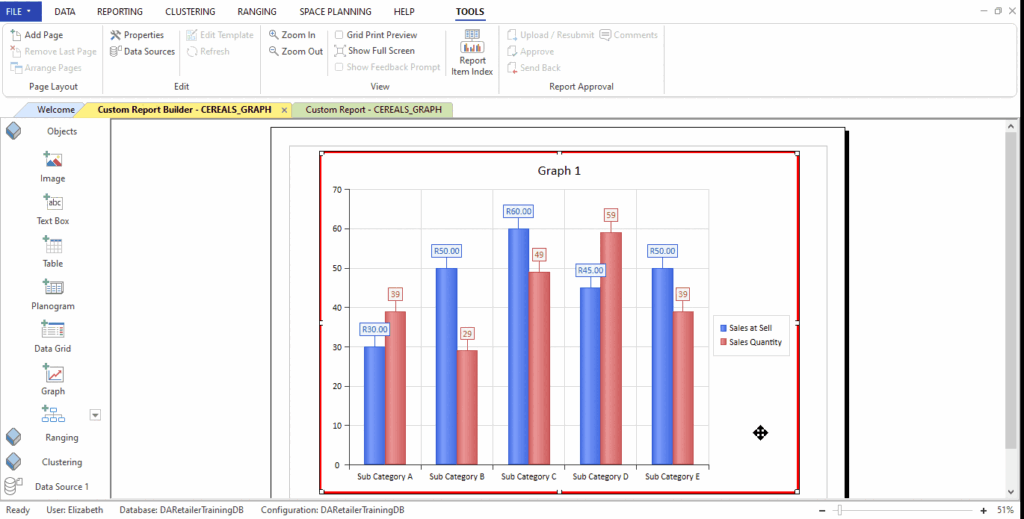
The graph template below shows you an example where Sub Category was one of the options inserted into ‘Measure Fields’ (X-axis) and %Sales and %Units were inserted into ‘Data Fields’ (Y-axis):
Once you’ve set your data, click ‘OK’ to add the graph to your report template. Right-click on the graph to select ‘Fit’ and ‘All Sides’ for it to fill the screen.
To find out more about linking a planogram highlight to a graph, read this article.
Should the above steps not work for you, please create a support ticket and DotActiv support will assist you in uncovering the issue.
Linking A Graph To A Planogram
When creating a custom report where you insert a planogram and a graph, you have the option to link the highlights of your planogram and graph. This will indicate the same highlight colours on the graph and the planogram.
This can be done while building your custom report. What you will need is a planogram inserter on your custom report. In the “Plano Properties” you have to enable the highlight settings as indicated below by enabling the “use highlight” option.
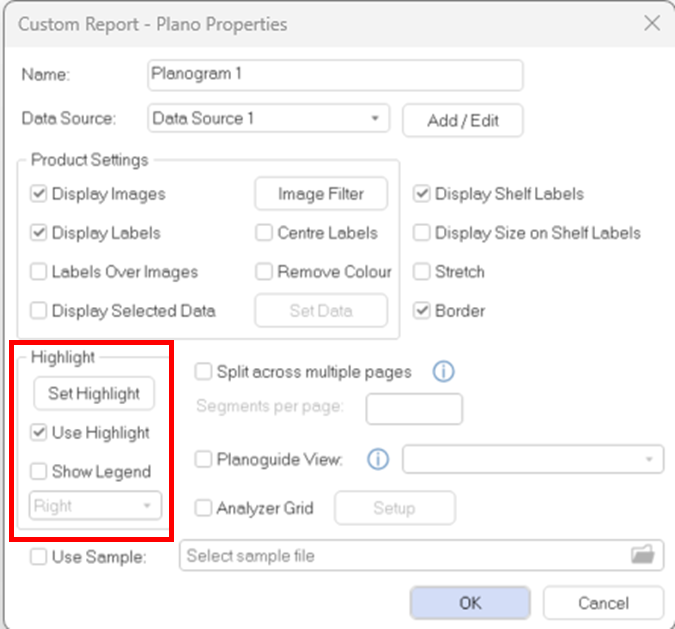
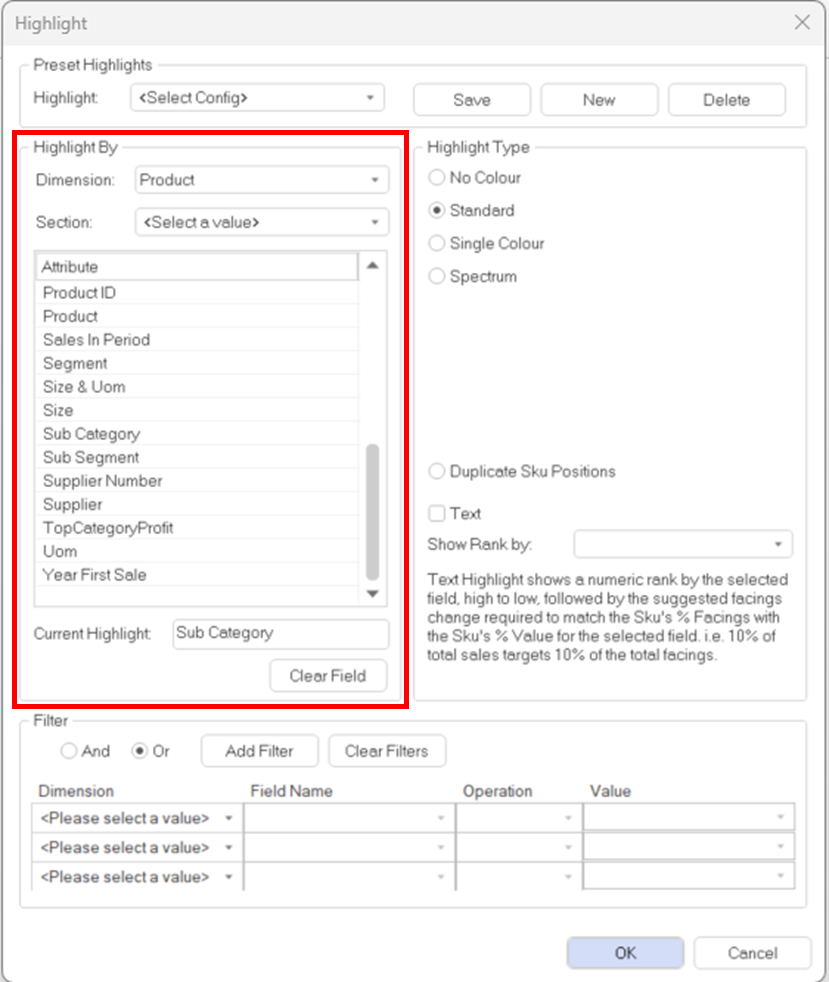
Then you select the highlight that should be applied in the “set highlight” option. For example, if you want to set the highlight on the “sub-category” classification you select the option and select “OK”.
Make sure you select the “Use sample” option and link your planogram that will be used. Select “OK”
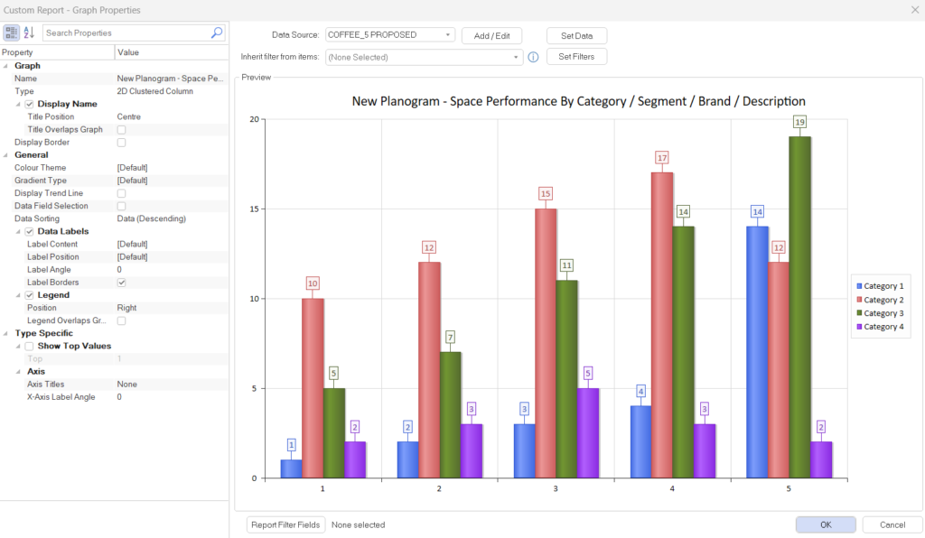
Now for linking the planogram and the graph. On your graph setting, on the drop-down menu at “Inherit filter from” you must select the planogram that you want to link to the graph.
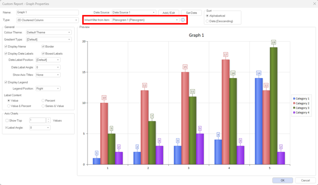
Remember to set your data fields for the graph before selecting “OK”.
Your planogram and graph should now be linked by indicating the same highlights based on the highlight setting you selected.
Apply Additional Filters To A Chart
Additional filters can be applied to a chart to further refine what data is available from the data source to report on.
Object Filters
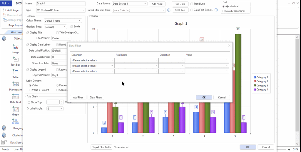
In ‘Custom Report Builder’, double-click on the graph object to open the ‘Graph Properties’ window. Next, click on ‘Set Filters’.

After the ‘Data Filter’ window opens, select the ‘Dimension’, ‘Field Name’, ‘Operation’, and ‘Value’. If you are happy with your selection, close the ‘ Data Filter’ and ‘Graph Properties’ windows by clicking on ‘OK’.
Once you have saved your changes, run the report. If you have already run the report, refresh the custom report.
The graph is now filtered according to your selection.

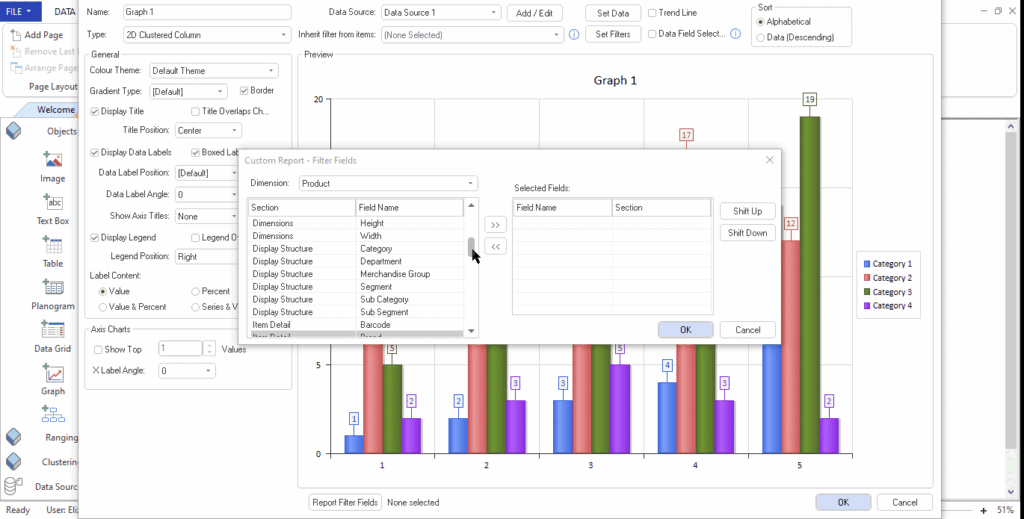
Add Additional Filters To A Populated Report
Fields can be added to a separate config for on-report filtering. Once the report is run, you can open the report settings and apply filtering on any of the available fields.
In ‘Custom Report Builder’, double-click on the graph object to open the ‘Graph Properties’ window. Next, click on ‘Report Filter Fields’ to open the ‘Filter Fields’ window.

Double-click on the fields that you would like to filter. Click ‘OK’ when you are done.
Once you have saved your changes, run the report. If you have already run the report, refresh the custom report.
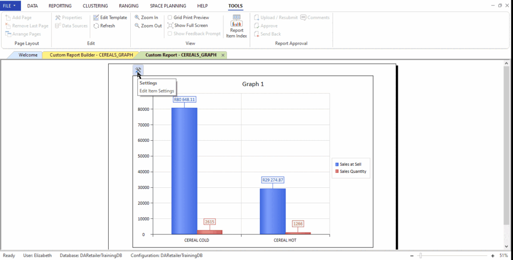
Navigate to the settings icon in the top left corner of the graph and select it. After you have selected your filter values, the graph should be filtered accordingly.
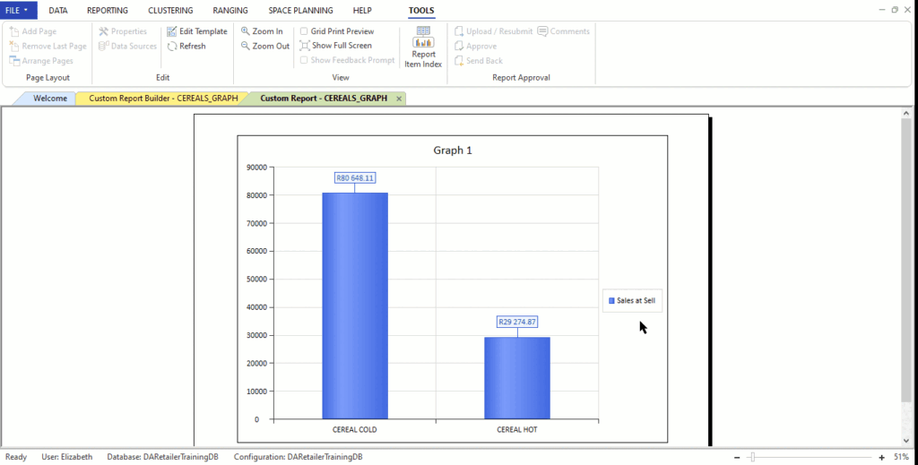
Split Data Fields To Only Show One Field
With this feature, you can configure the report to show multiple data fields, but only one data field on the graph at a time. You can toggle the data fields and change which data fields are visible on the graph.
In ‘Custom Report Builder’, double-click on the graph object to open the ‘Graph Properties’ window. Next, tick the ‘Data Field Selection’ box.
Once you have saved your changes, run the report. If you have already run the report, refresh the custom report.
The graph should now only show one data field at a time. To change the data field, navigate to the settings icon in the top left corner of the graph and select it. Click on the ‘Current Data Field’ drop-down and click on the data field that you would like to show.
Adding a Graph Trend Line
The ‘Trend Line’ functionality is a toggle to switch on the trend line which works off the first series of data, where there are multiple. The trend line feature will allow an individual to analyse Trends between different periods of data using the selected KPI for a graph.
To enable this function, open a report on the DotActiv software with a graph. Once the graph is open, double-click on the graph to open the properties window for the graph. The properties window will have the Trend Line toggle, ticking it will enable the Trend Line to show on the graph.
Toggle Graph Legend
The legend will allow the user to effortlessly identify data groups in the graph. The user can also customise the position of the legend relevant to the graph.
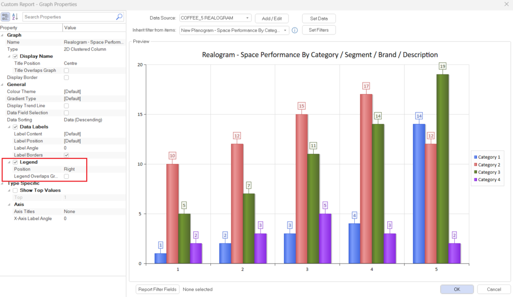
Additionally, once the legend has been set up, the user will be able to select a data group from the legend to toggle the item’s visibility on the graph.

Linking Objects to Multiple Data Sources
This feature allows the Planner to have multiple grids on a page and be able to link them to one object (such as a graph) and for the graph to reflect the connections from the grids. This is useful when using the filtering option on the grids to narrow in on each specific detail accordingly.
To use this feature please follow the steps below:
- In a report, insert a page and a Data Grid to the page, and link the data grid to a data source (a planogram, datacube, range, cluster plan or a CSV.). Once the pop-up window for the data grid appears, click on “Set up”, click on “Set columns”, then select a field and click on “OK”.
- Make Copies of the number of grids the Planner would like to use. Once the desired copies are made, change the fields of the relevant grids to display the data. To do this, double-click on the grid, click on “setup”, click on “set columns”, and change the field accordingly.
Tip: Click on the Grid and press CTRL + C on the keyboard to make a copy of the grid.

- Insert an object to link to the grids, for this example, a graph is used to link the three grids. When the graph is created, double-click on the graph, in the pop-up window, under “Inherit filter from items”, and tick on all the grids that the Planner wants to link.
- Click on “Set Data”, and select a measure field and data fields to be displayed on the graph.

- Once the grids are linked to the object, save the file and reopen it as a report to view the data grids and objects reflecting the data source that was initially linked. Filtering on the different grids will reflect that specific data on the graph as shown below.
- Following these steps will link the different grids to an object and allow the Planner to analyse specific data points.