The purpose of this article is to explain the process of creating custom graphs from a shelf plan.
Custom Graphs are graphs that are generated based on a built planogram’s data. It can bring a user to various insights such as whether products are over or under faced, whether days of supply are aligned across a category, which brands or subcategories are performing best in a category to name a few. Custom graphs can be generated before a planogram, during a planogram or after a planogram.
Setting Up A Custom Graph
With a planogram open, ensure you are in the ‘Tools’ tab. Next, navigate to the ‘Shelf Plan’ section and find the ‘Custom Graph’ icon.

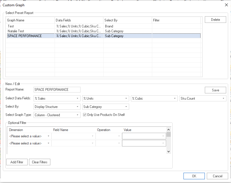
The ‘Custom Graph’ window will appear.

In the top section of the ‘Custom Graph’ window, you’ll find Preset Reports. These are templates of past graphs that you have created and can use again. Each template includes a graph name, the data fields included in the report, a ‘Select By’ field, which refers to your attributes, and any filters.
The bottom half of the window is where you can begin building a new custom graph.

Building a Custom Graph
Start by giving your graph a name.
Next, choose the data fields or measures you would like to compare. An example would be to compare sales contribution (%sales), units contribution (%units), cubic space (%cubic) and SKU count to evaluate whether space has been allocated optimally on the planogram.
Please note that %Cubic Space are usually compared with %sales and %units contribution to evaluate space allocation.

Thereafter, you will select the grouping for the measures. This can also refer to the (hierarchy) level on which you want to do the category’s analysis (for example sub category, segment, brand etc.) This can be done according to Brand, Sub Category, Segment and so on.
First, select the ‘Section’, and then the option in that section you would like to see.
Please note that you can run the same template on different groupings. Do this by selecting the saved graph template and changing the grouping of measures to the desired option before running the graph.
After you have set the fields for your graph, you must select the graph type and choose your preferred graph style.

When creating a graph, you can decide whether you want to analyse the data of the items on the actual planogram or if you want to incorporate all the data in your product report (that is data of items that doesn’t show on your planogram – has 0 facings – but it’s in your product report). You might want to analyse data by creating a graph before you start building a planogram, in which case you will untick the ‘Only use Products on shelf’ option.
Click ‘Save’ for the graph to appear in presets the next time you create a graph.
Click ‘OK’ to open the graph you have created. With your new graph open, you can customize the presentation (placement of logos, label positions etc.) by using the functions in the ‘Graph Options’ tab.
See below an example of a custom graph generated by DotActiv.
Should the above steps not work for you, please create a support ticket and DotActiv support will assist you in uncovering the issue.
