The purpose of this article is to provide you with an explanation of how to analyse data in the DotActiv software and where to access it.
Planogram Analyzer Function
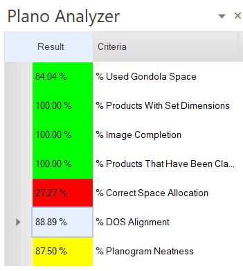
The ‘Analyzer’ function, found under the ‘Tools’ tab, is a function that evaluates the quality of your completed planogram according to certain criteria.
The criteria includes:
- Product attributes such as correct dimensions and presence of images, allocation and usage of space.
- The thoroughness of product classifications (according to the DotActiv hierarchy).
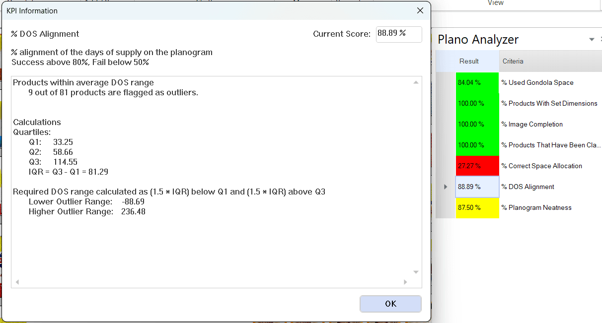
- Days Of Supply alignment (making sure all products’ days of supply are more or less in the same ballpark, with no or minimum outliers).
- Overall planogram neatness (making sure product tops are aligned, shelves are evenly spaced etc.).

The criteria used to analyze your planogram can be adjusted. Additionally, there are various other options available:
- The amount of facings displays the percentage of products with more than two facings.
- Congestion which indicates how full or empty the planogram is.
- Eco-Packaged Products, this highlights products with environmentally friendly packaging (focusing on their profit, sales, and unit performance).
- Sustainable Products, this identifies products that are sustainably produced (focusing on their profit, sales, and unit performance).
The window below will appear, allowing you to select additional criteria if needed.
On each of the criteria points, the DotActiv software will elaborate on how you can improve your score if you click on the desired field. See the image below.

Equalising Days of Supply
Days of Supply alignment is something that is of interest to any retailer. By equalizing your days of supply, you can ensure efficient stock replenishment rates.
Furthermore, it avoids unnecessary traffic of shelf packers running between point A and B between customers to fill certain parts of the shelf numerous times during the week.
By equalizing days of supply, you ensure that all/most items in a category are replenished at more or less the same time.
Days of supply is directly related to space allocation on a shelf. The more facings you add, the longer your stock will be on the shelf before it is cleared out and thus the days of supply will be higher (and vice versa). You can view days of supply in 2 ways:
- Average days of supply of the entire gondola. Do this by hovering over a blank space on the gondola, to see the statistic in the status bar at the bottom. See the image below.

- Days of Supply of a single product – This can help with equalizing days of supply by ensuring that each product’s days of supply are more or less in the same ballpark as the other products’ days of supply. The days of supply of a single product can be viewed in the following ways:
- Status bar – You can select days of supply as one of the fields you want to see in your status bar when hovering over a product. Do this by selecting File -> Setup -> Application Settings -> Status Text -> Status Bar -> double-click on ‘Days of Supply’ under the ‘Facts’ field to add it to the Status Bar -> ‘OK’.
Please note that you can remove a field from the status bar by double-clicking on the relevant field in the ‘Status Bar’ window of the ‘Status Bar Setup’ pop-up window.
- Floating status – You can select days of supply as one of the fields you want to see next to the cursor when hovering over a product. Do this by selecting File -> Setup -> Application Settings -> Status Text -> Floating Status -> double-click on ‘Days of Supply’ under the ‘Facts’ field to add it to the Status Bar -> ‘OK’.
Planogram Reports
Another way to analyse planogram data is by means of planogram reports. The DotActiv software provides various types of reports that will allow you to analyse the data. Some of these include:
- Product Report
- Fixture Report
- Shelf Report
- Plano & Shelf Reports
- Splits Shelf & Plano Report
- Changes Report
- ADDM Report
- Custom Graphs
- Custom Reports
Each of these reports has its own focus points on which you can analyse and review certain data related to the planogram.
The product report, for example, allows you to view various data such as Sales (Value & Percentage), Units (Value & Percentage), Forward Share, Actual Facings Deep and Capacity to name just a few. These are all dependent on what data you have imported and which columns you decide to show in the product report itself.
Highlights
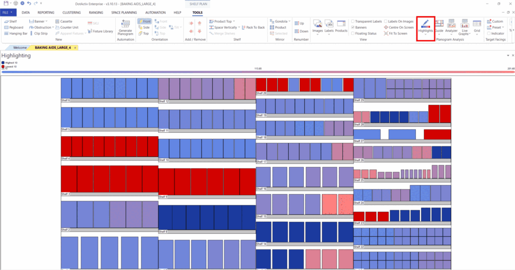
The highlight function in the DotActiv software helps you organise, group and analyse planogram data. You can highlight the top/bottom sellers or the slow/fast movers which can help determine what products to remove from a range or add more facings. It can also help gain insight into which products to place both on a macro-level (floorplan) and micro-level (on the shelf).
You can find this function in the ‘Tools’ tab under the ‘Planogram Analysis’ section.

Lastly, the ‘Guide’ function, in the ‘Planogram Analysis’ section, under the ‘Tools’ tab also helps to group products on the planogram according to certain characteristics. Just like with the highlight function, you will be able to identify groupings of products with the ‘Guide’ function.
Please note that we have introduced new criterion selection fields in alignment with our sustainability initiative. These options include Compostable / Biodegradable, Imported, Is Refill, Locally Produced, Made Using Recycled Material, Organic-Certified, Overpackaging %, Plastic Grade, Recyclable, Recycled Materials %, Reusable, Unethical Production, Unethical Production Detail, and Vegan. Any of these criteria can be utilized within this highlight feature.
Live Graphs
The ‘Live Graphs’ function is found in the ‘Tools’ tab.
With the ‘Live Graphs’ function, you can choose from a fully customisable list of graphs to view alongside any open planogram.
Please note that the first time you use this function you will be taken to the setup window. This means that you will have to set up your graphs first.
Once you have selected ‘Setup Graph’, the ‘Graph Properties And Preview’ window, will open. Here, you can create and customise the different graphs that you would like to use as seen in the gif below.
Once set up, you can just tick the box of the graph you would like to view and it will open up in a dockable window alongside your planogram.
The graphs created using this function are live which means that it will continuously update to reflect the data for the selected products on the planogram, as seen below.
Please note that this function allows you to open multiple graphs at the same time.
Analysis Grid
The analysis ‘Grid’ can be found in the ‘Tools’ bar. You can also set up your ‘Hierarchy’ or preferred ‘KPI’s’ from the drop-down menu.

Please note when clicking on ‘KPI’ or ‘Hierarchy’ from the drop-down menu, you will be taken to the setup window. You will need to set up this function if you have not worked with it before.
To set up your KPI’s, click on ‘KPI’ from the dropdown menu under the ‘Grid’ icon, the ‘Planogram Analyzer Setup’ window appears.
Add and remove the fields you want to analyse from the list on the left-hand side of the window by using the directional arrows, as seen below.

Once you’ve added all the fields you would like to use, click ‘OK’.
If you would like to set up your Hierarchy, click on ‘Hierarchy’ from the drop-down menu found under the ‘Grid’ icon. This opens the Hierarchy Field Selection window.
As with the KPI set up, you can add and remove fields by using the directional arrows, as seen below.
Please note that the ordering of your configured fields is critical as it dictates the structure to analyse your grid rows.

Once set up, click on the ‘Grid’ icon to access the Analysis Grid. This grid displays a configured set of KPI’s at each level of the specified hierarchy.
In the example below, we have already set up our hierarchy and preferred KPI’s and demonstrate how to use the drill-down function.
The refresh button can be used to repopulate the grid with up-to-date data from the planogram. This should be used after making changes to the planogram which may affect any of the KPI calculations.
Should the above steps not work for you, please create a support ticket and our DotActiv support team will assist you in uncovering the issue.
